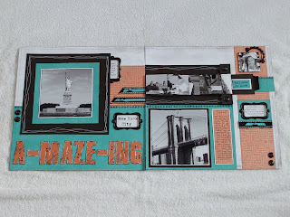
My husband and I spent a few days in New York City last summer. When I got home, I had enough photos that I couldn't fit them all on one layout the way I wanted, so I used a sketch from "Magic" and used the waterfall template.
As a whole, the city was overwhelming to me - SO busy all the time (mind you, we stayed right at Times Square)! The layout has a grungy look to it and that is intentional - as is the "A-MAZE-ING" title.
I wanted to get across the point that the city really is a big maze.
I wanted to get across the point that the city really is a big maze.
Did you notice the maze paper in the background??
Funky, huh?
The tread tracks on the title were created using a prescription pill bottle lid and black ink.
As always, click on the photos for a closer look.
Enjoy,As always, click on the photos for a closer look.
Alyson
All supplies used are CTMH unless otherwise noted
Paper: Hooligans
Stamps: Togetherness, Rustic Alphabet
Inks: Black, Sunset, Black Staz-On
Accessories: Colonial White Decorative Brads, Foundry Bookplates, Black Bitty Brads, Lagoon Mini-Medley, Black striped ribbon (ret.), Sewing machine and white thread, Foam tape, True Fit Folio (behind page 1), prescription pill bottle lid


No comments:
Post a Comment
Thank you so much for leaving a comment - it truly makes me smile :)